Introduction
A multi-select allows someone to choose one or more options from a list. It's most appropriate when there are 4 or more options to choose from, and those options can be represented in a one- or two-level list of short, text-only labels.
- Alabama
- Alaska
- Arizona
- Arkansas
- California
- Colorado
- Connecticut
- Delaware
- District of Columbia
- Florida
- Georgia
- Hawaii
- Idaho
- Illinois
- Indiana
- Iowa
- Kansas
- Kentucky
- Louisiana
- Maine
- Maryland
- Massachusetts
- Michigan
- Minnesota
- Mississippi
- Missouri
- Montana
- Nebraska
- Nevada
- New Hampshire
- New Jersey
- New Mexico
- New York
- North Carolina
- North Dakota
- Ohio
- Oklahoma
- Oregon
- Pennsylvania
- Rhode Island
- South Carolina
- South Dakota
- Tennessee
- Texas
- Utah
- Vermont
- Virginia
- Washington
- West Virginia
- Wisconsin
- Wyoming
- Meats
- Vegetables
- Fruits
Anatomy

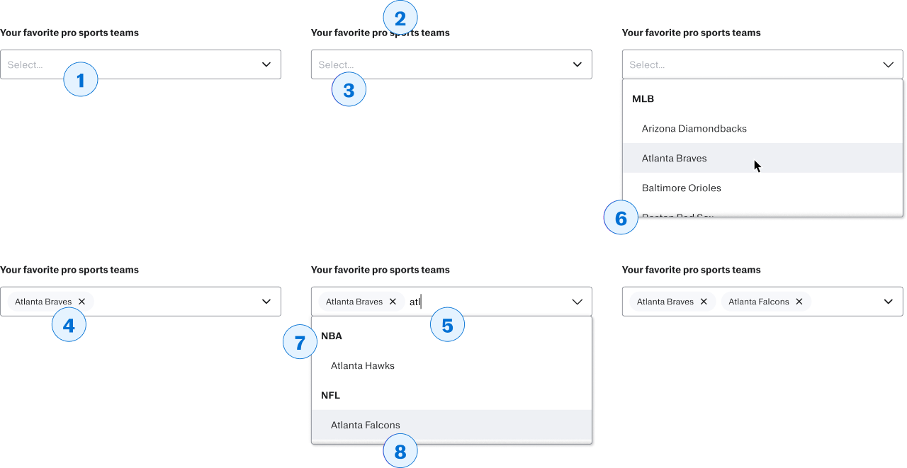
- Multi-select
- The area which will be focused when this component is focused; will contain the placeholder when the field is empty, the value(s) when options are selected, and the typeahead.
- Label
- Describes the purpose or meaning of the value to be selected.
- Placeholder
- Can be used to support the label; but should be used sparingly and the input should be understandable without it
- Values
- For each option that is selected, a Chip will appear in the select box. Clicking or tapping on the Chip will remove it from the field's values
- Typeahead
- Within the select box, after any existing values, the user can type to filter the option list down to remaining options that match what they’ve typed.
- Option list
- The container used to display the list of available options
- Option group label
- If the options have been put into groups, those groups need a short description.
- Option
- One of the options available to the user to select (as long as it isn't disabled!)
When to use (or not)
When to use
- If the user is being presented with at least 4 options
- If the user can select more than one of those options at a time
- If the options to choose from have either no hierarchy, or a single level of hierarchy
When not to use
- If the user has 4 or fewer options to choose from, and can only choose one, use radio buttons
- If the user has 4 or fewer options to choose from, and can choose more than one, use checkboxes
- If the user can select only one option, and there are more than 4 to choose from, use a select box