Introduction
A tooltip provides brief, informative, contextual, but non-essential information when its triggering element is hovered, focused, or tapped.
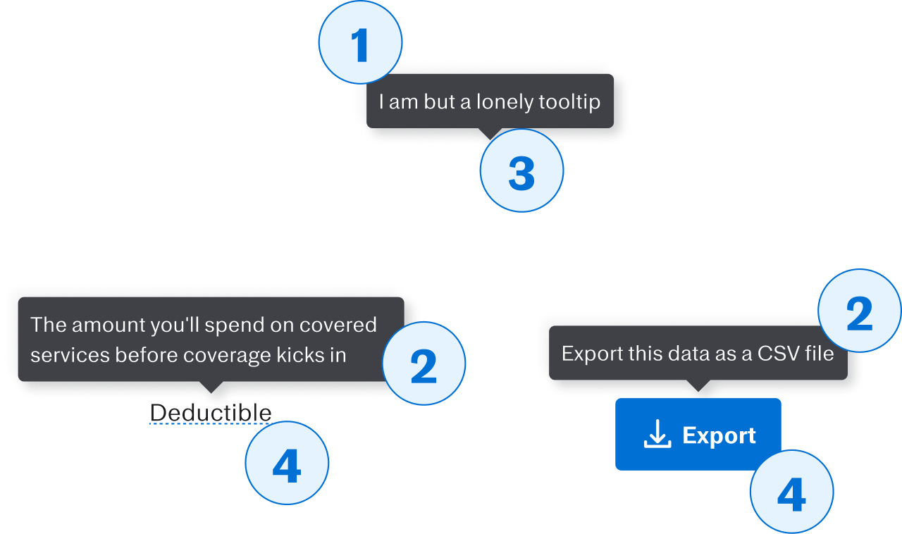
Anatomy

- Tooltip
- The container for tooltip contents, which includes the arrow.
- Tooltip contents
- The text inside the tooltip, that provides helpful information relating to the tooltip trigger.
- Arrow
- The small triangle on the outer edge of tooltip that points back to the tooltip trigger.
- Trigger
- The element that, when interacted with, causes the tooltip to appear.
When to use (or not)
- To describe the function or meaning of an element when it might be ambiguous
- To provide a label for icon-only buttons
- To provide a definition for potentially-unfamiliar terms or acronyms
- To provide essential information
- To display focusable content such as links, buttons, or form fields
- Inside focusable elements, such as links, buttons, or form field labels
- For information that you want to show up on page load
Usage in Figma
If you want a Tooltip to be triggered by a piece of otherwise-static text, use the Tooltip Trigger Text Figma component (say that ten times fast!).
If the text is part of a sentence or paragraph, it might be easiest to put the full sentence or paragraph in one layer, and the Tooltip Trigger Text directly above the matching text in that layer. Here's an example:
In the next section we'll talk about the different placement possibilities for tooltips. In code, the tooltip will be placed that way automatically; in Figma, you have to do it manually.
Options
Position
Default: Top
Where you want the tooltip to appear relative to the trigger, if space allows. In code, it'll get repositioned automatically as needed.
In Figma, you have to place the tooltip yourself, but this option will at least put the arrow in the right place.
You've got twelve options, in total:
- The four sides: top, bottom, left, and right
- Within each side, three options:
- the start of that side (e.g.
top-start) - the end (e.g.
right-end) - or right in the middle of that side, without a suffix (e.g.
bottom)
- the start of that side (e.g.
Inverse
Default: false
Set this to true on inverse backgrounds (dark backgrounds in light mode; light backgrounds in dark mode). That way the tooltip will always stand out against the background color.
Content
Keep it under 80 characters
Tooltips are meant to hold a sentence or so, not paragraphs. On small screens especially, it might be impossible to find a place where all the content can fit, the user's gonna try to scroll to read it all, and the tooltip's probably going to disappear in the process.
Accessibility
In terms of accessibility, there are two things to keep in mind:
- a tooltip trigger is a focusable element
- Focusable elements (e.g. buttons, links, form field labels, form fields, etc.) inside of other focusable elements are ignored by screen readers.
So that means...
Don't put a tooltip trigger inside of a focusable element
Tooltips can be put on a focusable element, but not inside them. In these examples, the tooltip is set to be triggered by part of the link text, or part of the button label. Not good!
Don't put a focusable element inside of a tooltip
Tooltips can have HTML inside of them, which means you can do things like bold part of the text, or add special characters. But that doesn't mean you should add things like links, buttons, or forms. Again, if users would typically be able to focus on it, it can't go in a tooltip.