Introduction
Historically at Justworks, we've used a single UI component, tabs, to fulfill several different use cases. To help people better recognize these distinct use cases, we should instead use visually-distinct components to represent them.
Tabs
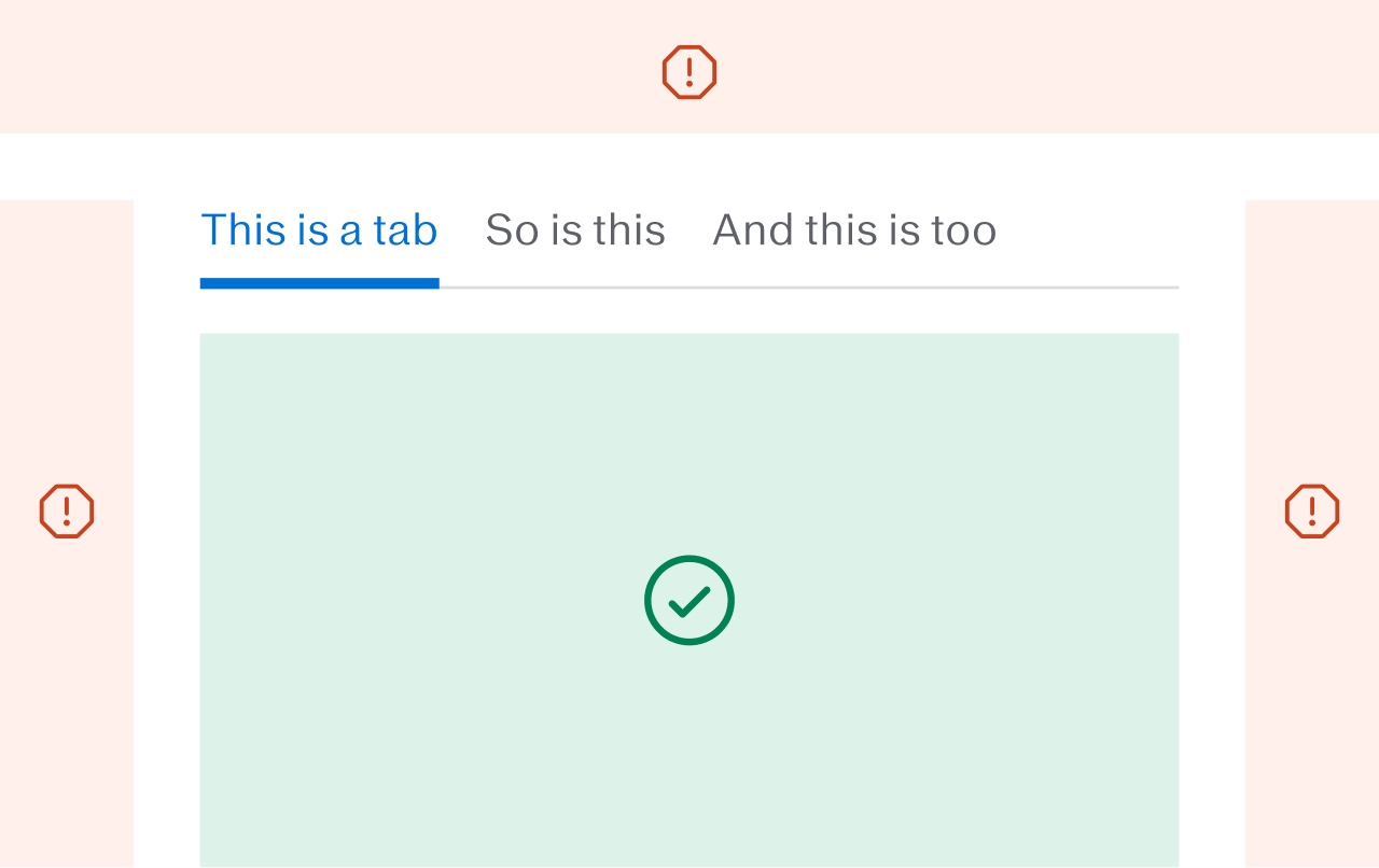
Tabs are used to separate distinct panes of content, and only show one of them at a time.
The horizontal line under a set of tabs is used to indicate that those tabs control the content below them. This means that:
- tabs should not control the content above, to the left, or to the right of them
- there should not be content below the tabs, in the same container, that the tabs do not control
Segmented controls
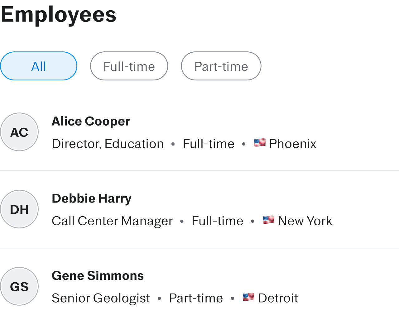
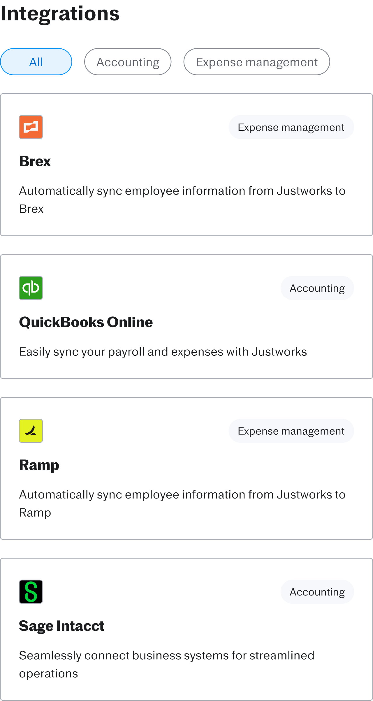
Segmented controls are used to show a specific subset of a larger collection of items, that are all displayed in the same way.
In other words, they function as a filter on a list of items. So it's usually a good idea to have one of the controls show the entire list.
In-page navigation
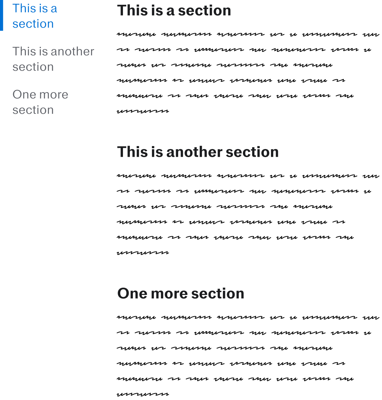
In-page navigation functions as a convenient way to scroll to different key landmarks within a page. As someone scrolls, the in-page navigation is always visible, and used to indicate to them where they are within the content.
Unlike tabs, all of the content that in-page navigation is associated with is always showing on the page. We’re not showing and hiding parts of our content, just scrolling to different points within it.
Accordions
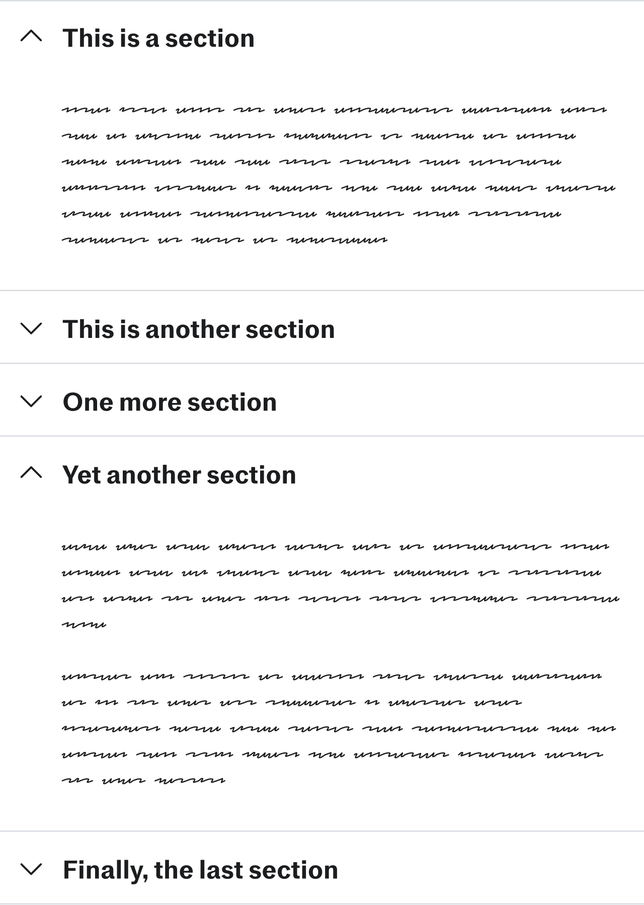
An accordion functions as another way to break up a continuous piece of content into sections. One can choose to view a single section, all of the sections at once, none of them, or anywhere in between.
