Shadows are used in our design system to create an illusion of depth. In other words, they make it appear that a given surface is closer to, or further above, the base surface of the UI.
Usage
Level 1
- Resting state for elements where you need to emphasize that they're interactive (e.g. cards)
Level 1
Level 2
- Hover state for elements where you need to emphasize that they're interactive (e.g. cards)
- Listboxes and menus
Level 2
Level 3
- Tooltips
- Popovers
Level 3
Level 4
- Sticky headers or footers
- Modal dialogs or drawers
Level 4
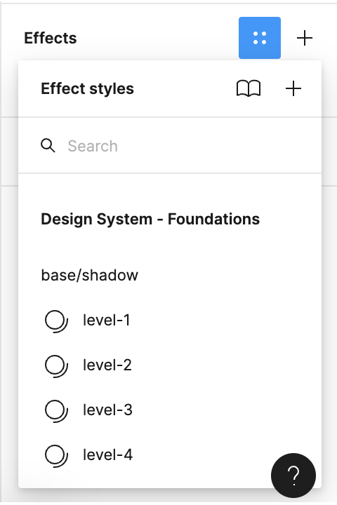
Usage in Figma
Shadows in Figma are applied using Effects. With the element you want to add a shadow to selected, scroll to the Effects section of the right sidebar, click on the ⸬ symbol, and they should be listed there.
